
Toydle
No toy gets left behind
UI/UX Design by Micole Simpson
What is Toydle?
Solving a toy recycling problem
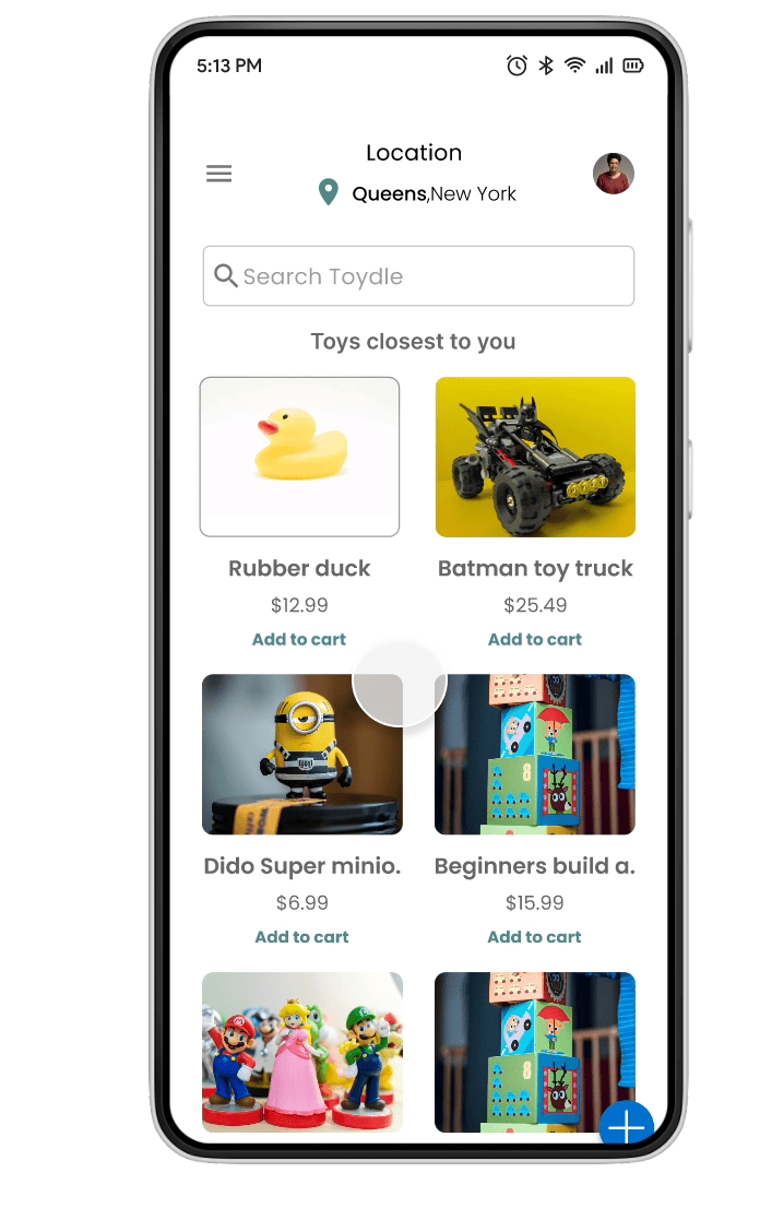
Toydle is a new app on the IOS and Android play store. This app aids in sustaining the life cycle of a toy by creating a safe and ethical marketplace for its users to buy, sell, or donate toys. Parents have seen a challenge where their kids quickly dispose of a toy once it breaks or no longer serves value to them, donating is a rewarding option and is optimally the first line of defense, whilst selling that unused toy prevents one less plastic waste in a landfill.
Design Objective
To create a visually appealing and seamless app where households that contain toys can be encouraged to organize and recycle their toys in a cost-effective way.
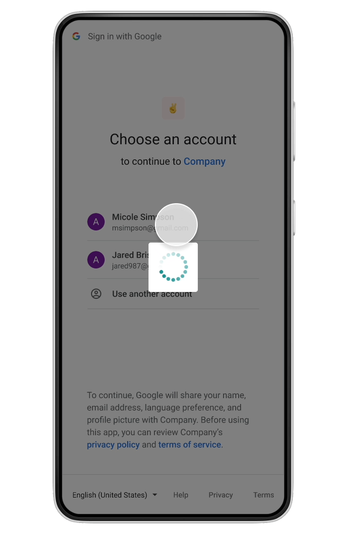
Role: UX/UI Designer - Time: 12 weeks - Tools: Figma, Sketch tool (paper and pen), Client(s): RVC Moms group (board committee) Challenge: Having too many toys to sort through or get rid of. - Solution: Providing a fast and efficient way for individuals to group items for sale and donate in one go. Outcome: Happy parents and effective toy decluttering of homes - Process: Agile - Result: Have users buy, sell or donate toys of any condition.
BUYING
"Americans buy $18 billion worth of toys annually. As kids get older their interests shift and acquire a mountain of unused, broken, and obsolete toys"
-Treehugger.com Jan 6, 2021
selling
Selling toys will teach your kids to hoard fewer items, take better care of their belongings and sow the seeds of entrepreneurship
-blog.carousell.com March 7, 2021
Donating
"Toy donations bring happiness to other kids and give them support. Children need the fun time as a distraction and they can also learn and develop more, using their imagination and creativity."
-lgw.org.com Aug 6, 2021
Toydle's design process
UI strategy
Empathize: I wanted to understand my users and gain insight on their thought processes and feelings concerning toys in their households - Define: With a time of 2.5 months to finalize my project plan and User Interface, I engaged highly in comparative analysis to aid in my ideation phase. How would I like this app to look? How can I formulate my brand and style guide? What is the tone and voice of my app? - Ideate/Prototype/Test: This process focused on my initial sketches to low then high fidelity mock-ups, where I tested this product with 2-3 individuals.

Setting the tone and brand recognition
A Mood Board creates a vision
Why a mood board: At the start of my ideation process a certain tone had to be illustrated consistently throughout my brand. I began understanding the tone and visual experience I had to communicate to my users. Elements - Typography: Poppins - uppercase, lowercase, simple and clean - Icons: Outlines, Glyph - Buttons: Rounded corners, solid, outlined, minimal and simplistic - Form elements: simple, short. Components - Illustrative cards, drop shadow, flat 2-dimensional, short links,
.jpg)
Valuing market insight and trends
Secondary research: how are they facilitating their users?
Offer up -As a customer to customer facing mobile app this unique marketplace was number one as competitor focused analysis. Both the seller and buyer would make a tentative agreement about a particular item and either or meet up in person or arrange for shipping the item to the buyers location. An item can be carefully inspected in person or a sellers rating can give comfort to the buyer knowing that their being sold on quality


Let Go -Let go is very similar to offer up and was recently acquired by Offer up where the two eventually merged. However this particular app showcased the way in which second hand items are handled in nature. The app not only guides you in the best way possible to sell a item but it makes setting up your listing simpler, quicker and, more fun with a step by step instruction process. I focused on the selling aspect of this app and really liked how they were setting up the user for success.
eTOY IOS app - Since I am building a native IOS application I founded several buy, sell, swap toy application platforms. From this I was able to categorize a child's age and get a general idea as to what significance did the toy condition play when the user was seeking a second hand item. Even though user discretion is made when listing a item it was very interesting to see how other apps dealt with this and identifying their baseline of the problem.


Facebook market place - Widely recognized and heavily used by over 15 million users. My donation aspect was yet to be covered so I began covering ground on where I would acknowledge particular items being given away or sold for a small cost. People were able to bargain for products once the seller enables that action.
Building a style guide
Constructing a section and interactive flow
Whilst my main goal in attaining a smooth flow was to limit as much friction as possible to the user, I wanted to primarily focus on how I was able to build out my MVP's of buying, selling and donating. This included interactive components, states, drop down tabs, selection, buttons etc.
.jpg)
Checkout- Building out this section required interactive components and states to let the user be aware of the action that they're taking part in. Icon pairs of a radio dial is utilized when there is a list of two or more options to select from that are mutually exclusive, for this the user must select exactly one choice ( payment & shipping ). Checkboxes are seen parallel to the shipping address listing as a usability option for a yes/no choice.
Toydles design system (making visual aesthetics appeasing) - Typography: Poppins in a bold and regular state was chosen for its simplistic and light on the eyes feel. Poppins is currently the most popular typography style on the market. Spacing and Scaling: Spacing varied based on pairings of unit headers and cells to make a particular unit. This makes picking appropriate pairings easier and quicker for building out sections such as drop downs, field inputs and a checkout experience. Font weight: In CSS, you can specify font-weights other than normal and bold. For my pairing of weight I used the standard sizing range between 400-600.
Conclusion - For good design system, these guidelines were set in place for consistency and transparency. Once these practices are used correctly then adhering to UX/UI principles would prove a good layout in terms of accesibility
And the rest ?
UI principles and strategy
Selecting icons, components and structuring modals are essential to UI design and adds value in speeding up user interaction. Why ? They add visual interest to the user interface and makes hot spots scannable. Choose icons made with a simple shape, icons should not be busy and not carry a hectic look and feel. Choosing icon packs with several variants, this allows for components to remain consistent when a user either presses or selects a action to follow suit. Components and icons with similar weights, I ensured that no matter where the icon was used they had similar weights so that screen real estate didn't seem unbalanced or mismatched.

Core functionality
Here begins the blueprint of our design process
Core functionality
Here begins the blueprint of our design process
Here is what I found, while my goal was to mostly focus on having the most aesthetically appeasing visuals I had to understand how to rearrange the baseline of my screens starting with the login page. Here I chose how the relative placement of screen elements can affect how a user can sign in/ sign up. Since this is the first page that user see's I made sure that both returning and new user would have a frictionless login process. As I began to sketch out several iterations of how my screen should be there was several back and forth for my main MVP's (Minimal Viable Product). Wireframing helped save me time with my low fidelity mockups as I was able to make quick changes in this process.
.jpg)

What went wrong in this section
I tried to nail several screen elements in this design phase however the nuance that I dealt with was trying to imagine what these black and white images would look like in color. The wireframing seems like a great fit for gauging yourself into a low fidelity mock up, but my vision became somewhat a stumbling block when I wanted to see how other screens looked and it became clear to me that this phase was just becoming too confusing.
Here is how some of my sketches actually looked and the problem I had behind each one.

My login/ sign up page did not have field inputs for a returning user, this would then navigate them to a second page which I thought of as a bad user experience. To correct this I had two field input boxes on the said page for users to login and kept the google and facebook sign in. Home page seemed extremely busy and non sensical, I was mimicking the layout from my competitor analysis and found this to be very off from what I envisioned for a toy app, I corrected this by having bigger images, adding a navigation bar and fab icon then allowing users to begin shopping on my home page. Sell a item, the visuals and screen space seemed too minimal and only had words, which proved boring and lazily put together. I went offtrack by exploring rounded corners for my buttons and realized the consistency would not be maintained if I went this route. Charity donation page was still not clear and accesibility and flow proved difficult in my sketches. I was still a bit conflicted with how this page would be and hoped to gain more clarity in my Low fidelity skecthes.
Low fidelity wireframing
Based on initial sketches and feedback from testing my flow cycle, I wanted to make sure that I was actually solving the problem and taking accountability for each testing data .

What I learned
-
Intellectually - Whilst the project seemed overwhelming at first. I started to dissect all my ideas into groups and worked from top level to identify key elements that needed to utilized in a user flow.
-
Cognitive space - Of course I wanted as much content as possible but that oftentimes defated the person of not overwhelming the user
What did not work
Not every detail makes the cut
-
Tap only items for buying - Everyone loves to tap and end up somewhere that's presumably the direction that they think they may end up. The home page seemed very busy with little to no direction, leaving the user confused and unsure of what to do. Bigger pictures and a add to cart link was a clear selling point of how a user thinks when purchasing a item
-
Navigation bar with no icon - The buying and selling aspect were very similar so I felt like my navigation bar become overcrowded and busy. Adding the fab menu icon with a bottom sheet would be a more favorable prompt than a eye sore of how I envisioned my navigation bar to look.
The prototype
For a better experience, open this on your desktop. Mobile works too!
Hint: To restart protype press "r" on your keyboard
Constraints ! Here is how I dealt with them
-
My process - Ideally I wanted to start designing my screens right away but this would create not so mindful ideas and would confuse by user flow process. How I dealt with it: I wanted to get my point accross clearly so I started my ideation process of seeing what/whom my competitors were and sketched out on paper how I would envision mine
-
Timing - My app had 3 Minimal Viable Products and I felt as if I didn’t have enough time to have a full functioning app. How I dealt with it: Each day I ensured that I iterated on a certain flow to ensure that my process was making sense.
