CITY-PUPS
Google Design Sprint
Introduction
This project was completed as a part of Springboard's UI/UX Design Course. I was faced with the challenge of producing a modified version of Bitesize UX’s GV design sprint for the startup company called CityPups.
Being the sole designer on this sprint, I utilized the following skills to help me engage with this project.
-
User Empathy
-
User Research
-
User Testing
-
Design
-
Prototyping
-
Validation
-
Iteration
-
Sketching
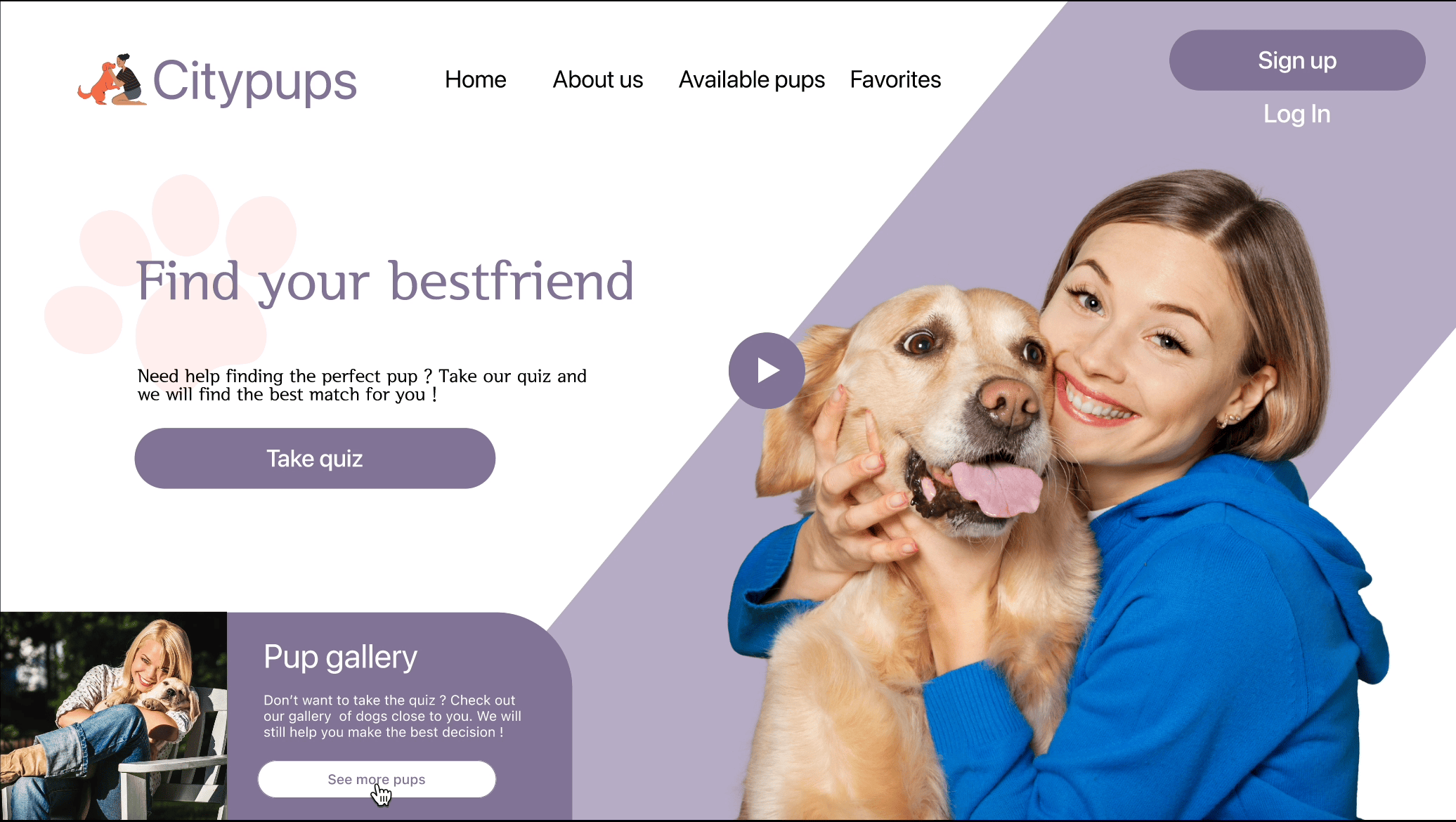
As a dog lover and designer, CityPups model afforded me the exciting prospect of engaging with the dog and city living community as a whole. The app’s core design centers around users looking for a dog that will be a great fit for them and some of their specific needs.
Challenge Brief
As a new start-up, CityPups identifies the goals, challenges, and constraints for people within the city looking to adopt the perfect pup. CityPups is not a virtual store, however, it aggregates adoption dogs from local sources such as shelters and various adoption centers. CityPups is designed as a website for larger screens which includes desktops and laptops.

User Persona
Ellie, 27, lives in a studio apartment in NYC by herself, and she is looking for a best friend to become her new roommate. She has already started her research and has become very familiar with the type of pup she is looking for and can accommodate.
Behaviors
-
Ellie lives by herself in a studio apartment.
-
Ellie has been on the lookout on various social media platforms and been bookmarking her favorite resources.
-
She continuously asks her close friends, family, and neighbors for any news on her situation that can help.
Frustrations
-
She hasn’t found the dog that is near her living and personality ratio.
-
Adoption agencies make it a focal point of connecting a dog to the owner instead of their living situation and style.
-
Descriptions of the dogs are too broad and don't give specific details such as needs, size, and behavioral patterns.
Goal
She wants to find the perfect dog that she can connect with on an emotional and practical lifestyle level
Day 1 - Understanding the problem
Synthesizing the research
As the lead designer and UX Researcher, on my very first day, I took into account conducting some usability testing for insight briefing. Our interviewee shared similar commonalities of our user persona Ellie. Our interviewee‘s name is Jenifer and she lives in the city with her boyfriend in a small apartment. Jenifer is actively looking for a dog that is suitable for her living situation.
Meet Jenifer,and here's what she had to say!

Pain points of frustration
“Various platforms haven’t really given me the ideal description of how I would like to view the pup I’m looking for”
Priorities and consideration
“Size is really important to me, not to mention their activity level and interaction with other persons. We live in an apartment complex with other individuals so we wouldn’t want a pup to be barking constantly or a pup that we know we probably have to walk 3-4 times a day”.
Successes
“We definitely want a dog so ideally, I’d like to know their story and age, this makes a great match in giving the ideal pup the forever home”
After synthesizing my research I strongly considered doing an end-to-end experience model so that I can visually lay out how the user utilizes the platform.My overall goal in utilizing this feature is to identify key decision-making gestures and allowing for me to understand the user's connection with their pup.

End-to-End User Experience model 1

End-to-End User Experience model 2
Day 2 Sketch
On day two of my Design Sprint, I ventured onto the solo version of lightning demos where inspiration is drawn from similar platforms that offer the same services. In doing these demos we looked at the solutions solved by other products and the steps they took to solve them. Whilst looking back at Day 1, I sought to find out ways in which the user can be completely satisfied with their final decision. Examples that I felt that my user persona Ellie would closely relate to were :
-
WeRescue
-
Petfinder
-
PuppySpot


WeRescue puts their users at ease by giving them ease of access to how their choices are made with 6 key features. What I liked about this product is that they gave full descriptions on all dogs and their moto appeals to adopting instead of shopping at breeders.
PetFinder is the nation's leading adoption source for finding a pup and has categories for their pup’s breed. They have 10 ideal filters ranging from coat length, to what and who the pup is good with.Their process is ideally a one minute application process, compatibility test, then finally a match!
PuppySpot allows users to have an account to keep abreast with their favorite choices. Their landing page is pretty simple and straightforward with the adoption process from adopting your pup to taking them home. In regards to screening you fill out an application and wait to see if you’re a match
Crazy 8 sketches The Solution


The Solution
My second landing page seemed more ideal with both a vertical menu and a scrolling option for seeing various pups. Ideally I wanted to ensure that the users are at ease throughout the entire process so my choice of filter option one deemed fit.
Day 3 Decide/Storyboarding
Because I’m working solo on this design sprint, I would have to resonate with my solutions to produce a storyboard. I want my user to feel comfortable and confident in the decision-making process. Seeing that the landing page is what usually gives the user the first impression, I ensured that this page provided simple and effective navigation for finding the right pup.


Day 4 Prototyping
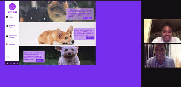
I wanted my prototype to be as efficient as possible, meaning giving the user little to think about when they’re making the ultimate decision in choosing the “pawfect” pup. Constructive criticism from my sketches had me tap into my creative design mindset and gave me UI motives for the CityPups framework. The design of the prototypes gave a simple yet intuitive approach to getting to know the user. At first, users are given the option to watch their pup in action, take the pup personality test, or quickly adopt. I tested my prototype with 5 individuals who related to the idea of adopting a pup. After my first round of testing, I was able to pinpoint several issues that I corrected for my second round testers.

Day 5 Testing and Results
User Feedback and Results
Each user was able to demonstrate how they would match themselves with the ideal pup, and this was easily identifiable by the take test call to action button. However, I noticed that 3 out of 5 users were searching for this option in the menu bar rather than the landing page itself. What really interested users were the ability to see their desired pup in live-action and many expressed their desire in liking this option.
Quoted user feedbacks
“I like the purple, however at some point I find It overwhelming on some pages”, Tanya K.
“Teacup has got to be the cutest thing I’ve ever seen”, Tanya K.
“I really like the fact that you guys outsource from local shelters, it gives me hope and joy in knowing that these pups will find a home”, Jordan R.
Results & Findings
-
4/5 users said they would take the personality test to have them matched to a pup. The other user when asked why this wasn’t his choice, he expressed to me that he would rather read about each dog individually.
-
5/5 users found the pup in action screen helpful with just one shortcoming. A user expressed that a dog has many moods and seeing them play in action for a scene or video may not necessarily showcase their best trait.
-
2/5 users suggested that they should be able to apply and get to interact with the pup in a cohesive manner
-
A suggestion was made, whereas a user is able to upload their living space and see how ideally the pup would play in it
.
Conclusion
My overall experience with doing a design sprint was indeed challenging but a very rewarding experience. One of my key takeaway elements was fine-tuning my rapid prototyping skills and discovering how empowering user empathy can be. My favorite exercise was the crazy 8 sketches that improved my UI skills and to my surprise my design thinking. I would definitely use a design sprint for projects that I deem fit for its usage mainly due to the time constraint and allowing for user feedback to alter my designs to perfection